Megabrewers, such as Budweiser and Miller, spend millions marketing their latest retro can, funky bottle or limited-time labeling, including Budweiser’s “America” labels this summer. But what’s inside never changes, essentially making it all just a lot of marketing mumbo jumbo.
“Beer labels are the new album covers,” said Paul Young, a brewer at Monnik Beer Co. in Louisville and former owner of a homebrew supply store.
Through the years, beer labels have evolved, at times offering vibrant colors and imaginative designs, and, at times, giving us little more than a logo and perhaps a slogan.
Beer labels on Louisville-brewed beer began to emerge around 1915, according to Peter Geutig, who wrote “Louisville Breweries: A History of the Brewing Industry in Louisville, Kentucky” with Conrad Selle. Prior to that, most bottled beers from the dozens of Louisville breweries that existed around the turn of the century were sold in embossed glass bottles, sometimes clear and sometimes dark brown. Some, as with the Oertel Brewing Company, featured elaborate fonts and designs, while others, West Louisville Brewery, for instance, simply stated the name of the brewery.
Paper labels gave brewers new ways to sell their beers.
“Beer labels in the beginning were very colorful and expressive,” Geutig said. “One interesting thing about the early beer labels is they had a lot of information about the beer.”
Looking at today’s craft beer labels, it’s as if we’ve come full circle, in a loose way. Today’s craft beer labels are often brash, creative and eye-popping. Perhaps pre-Prohibition labels don’t quite deserve those adjectives, but they spoke loudly in their own ways.
During various periods, the federal government required verbiage such as “Tax paid at the rate prescribed by Internal Revenue law.”
Boring.
But as an example of creativity, early labels on Frank Fehr Brewing Co. bottles featured bright red and blue colors and offered such teasers as“Rich in Aroma & Flavor.” On its iconic Fehr’s XL, labels would tout the contents as being “The Beer That Xcels.”
Subtler, but showing a deeper level of creativity, is an illustration that appeared on Fehr products for years, which is believed to depict King Gambrinus presenting a Fehr’s beer to Columbia. King Gambrinus is the patron saint of beer, while Columbia was a symbol of freedom in the United States.
“To me,” said Jeff Faith, the Louisville beer enthusiast who owns the copyright to Fehr’s XL, “the whole symbolism in the middle of that logo is really interesting. It’s saying, ‘Hey America, here’s your beer.’ And it’s a little company in Louisville, Kentucky. It’s a bold statement.”
Billy goats AND BEER!
Goats were another enduring image on early beer labels. This is based on a German tradition that traces to the spring release of bock, a lager that, before refrigeration existed, was fermented underground during winter months. It was a full-bodied, dark beer that contained a lot of flavor and alcohol. The annual release was a sign of the coming of spring in Louisville and other cities with a large German population. Bock Day was akin to today’s Oaks Day, with people taking off work to celebrate and imbibe.The goat was the image that always accompanied bock beers — “bock” being the German word for “billy goat” — and before there were beer labels, there were goat posters all over town announcing the coming of Bock Day. It was a natural progression that when bock beers began being bottled, an image of a goat would adorn the label. The tradition has not been forgotten in Louisville; the goat races at the annual NuLu Bock Fest are not just there to make the kids squeal. (Billy Goat Strut and Nanny Goat Strut alleys were named for the goat races held there. Really.)
After Prohibition, strict laws governing beer worked to stifle creativity. As beer got less and less diverse, labels became more and more simple. As media technology advanced, color print ads, radio jingles and TV commercials gradually became a way to market a beer brand. Perhaps the strategy was to keep labels simple and recognizable.
Looking at local beer labels from that era, three iconic ones were Oertel’s ’92, Fehr’s XL and Falls City. Their labels varied when seasonal or alternative beers were sold commercially — one Fehr’s label featured thoroughbred race horses — but the key brands remained fairly consistent. The iconic round Fehr’s label with the red border and King Gambrinus in the center remained for decades. And then beer effectively died in Louisville in 1978, following the demise of Billy Beer and Falls City Brewing Co.

Label controversy?!
Local beer has come back to us. And if we know anything about modern brewers, it’s that there is no lack of creativity. There is also plenty of humor; sometimes it’s even bathroom humor.Against the Grain Brewery enlists local artist Robby Davis and others to design its labels, which are rich in color and character. Each label is unique and elaborate, and the concepts are done through a standardized process, from conception to design.
One that has drawn mixed reviews is the label for the humorously-named The Brown Note, a brown ale named after a hypothetical frequency that would cause people to... uh, involuntary defecate. The label features a cartoon sketch of a heavily-tattooed man holding a roll of toilet paper and wearing tighty-whities. The perspective is from behind and the man’s underwear is badly soiled. The description on the label even includes the teaser, “Drink this beer or shit yourself trying.”
In April, the Brewers Association, a national trade group representing craft breweries, imposed rules aimed at curbing sexist and other potentially offensive imagery from labels and other beer marketing. Calling it censorship, Flying Dog Brewery of Maryland, canceled its association membership last week (among its beers are the Raging Bitch, Pearl Necklace Oyster Stout and Doggie Style Pale Ale). There have been no reports of the Association singling out a brewery for its label.
It will be interesting to see how labeling control shakes out in the industry.
Sam Cruz, co-owner of Against the Grain, knows some people are offended by the concept of The Brown Note, but he isn’t concerned.
“We’re not out to offend anybody,” he said, “but we’re a very niche product. Craft beer is still a very insignificant portion of the market share. Further with that, Against the Grain is niche within craft beer. We have a targeted audience and we talk to them. If we offend somebody, it’s highly possible they found us, we didn’t find them.
“Realistically, anybody who’s offended, in my opinion, they’re out there looking for it. Right now, that’s the world we live in. I’m not sure if it’s going to change and I really don’t care.”
Truth in advertising ‘Let’s not scare people’
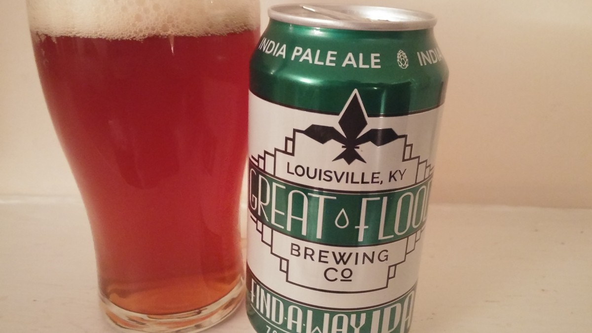
When Great Flood Brewing Company was preparing to can its beers, deciding on the artwork was a long process. The ultimate decision came down to revolving around the brewery’s throwback logo — the brewery’s theme is the 1937 Flood — with splashes of color. The Find-a-Way IPA got green, while Toasted Brown got brown, tan and pale yellow.“We probably looked at thousands of different labels out there,” Vince Cain, co-owner of Great Flood, said. “We wanted something that was a good representation of our brand, but something with a ‘cool factor’ to it.”
What they considered were things including where the beer would be sold, who would be buying beer in those locations and what they would be attracted to. Cain said they also wanted to make it obvious what type of beer was inside, noting that green is usually associated with IPAs and brown fit the style of the Toasted Brown.
“The colors are kind of old-school, throwback colors, but it also gives you an idea of what you’re going to be drinking,” Cain said. “We thought, ‘Let’s not scare people away with a big, dark color.’”
Falls City Brewing Co. has been bottling beers for several years and while it has retained the iconic logo that was invented prior to Prohibition, it took a sharp turn when releasing Hipster Repellant IPA about four years ago, employing graphic designer Nick Karl, a friend of Falls City General Manager Drew Johnson, to create an iconic cartoon hipster to represent the beer.
More recently, however, the “hipster guy,” as he is affectionately called, was replaced with a character known as “hop head,” a hope cone with sunglasses.
“We actually kind of lost some sales on Hipster Repellant IPA, because people didn’t associate [the new logo] with the beer,” Johnson said. “They couldn’t find that hipster guy.”
When Falls City shifts from bottles to cans this fall, new label designs will be unveiled, including a new logo that combines the original hipster guy with hop head, he said.

‘Beer labels can get a little too playful’
So, what constitutes a good beer label? It depends on the consumer: Some want the label to grab their eyes, while others want the label to inform them. Some want both.Sometimes it’s a logo. Sometimes it’s a color scheme. Other times it’s a slogan or back story.
Monnik Beer Co. has employed a teal, art deco can that visually pops off store shelves, which was the whole idea, according to co-owner Brian Holton.
Mile Wide Beer Co. sells cans and crowlers out of its taproom that feature the brewery’s bridge logo and stickers to identify the beer.
Apocalypse Brew Works sells crowlers and occasional bottles with a nuclear bomb image designed by head brewer Leah Dienes.
“I love shopping for beer,” Cain said. “It’s a passion of mine. I want the label, as a consumer, telling me something about the beer.”
He points to Three Floyds Brewing as a wildly popular brewery whose labels, and often its beer names, mean absolutely nothing. “Apocalypse Cow,” Cain said, chuckling while referring to one of Three Floyds’ IPA releases. “What does that mean?”
Faith, the beer enthusiast, said he has a minimalist approach to beer labels.
“Honestly, most of the time, it’s simplicity,” Faith said. “I don’t think things need to get too complicated. If you go too far, I honestly think it starts to look like a soda. The beer labels can get a little too playful and almost not look like beer.”
Johnson pointed to a middle ground: “There’s so many labels out there. You have to have something that will initially catch the eye; there’s no way around that, because of how crowded the beer shelves are. It doesn’t have to be flashy, but it has to have personality. You drink with your eyes before anything else. I feel like, if they didn’t put a lot of effort into the label, they probably didn’t put a whole lot of effort into the beer.”
Young, the former owner of a homebrew supply store, collects local brewing memorabilia. “It’s a medium for artists to really explore their talent,” he said.
He admitted that if he is in a bottle shop and is deciding between two beers, he will usually go with the one bearing the label he prefers.
“It’s funny now, how I really try to think about if it’s the label they’re trying to sell me, or the beer inside the can,” he said. “It’s all about balance. If you have an artist, you can let them loose and do their thing, I think that’s always best.”
But he also knows that many people love the retro-looking beer cans and bottles, and some of those do harken to pre-Prohibition days of Greek images and retro fonts.
“People want something that’s recognizable, that they can depend on,” Young said. “I think it’s up to the breweries to make good on that.” •