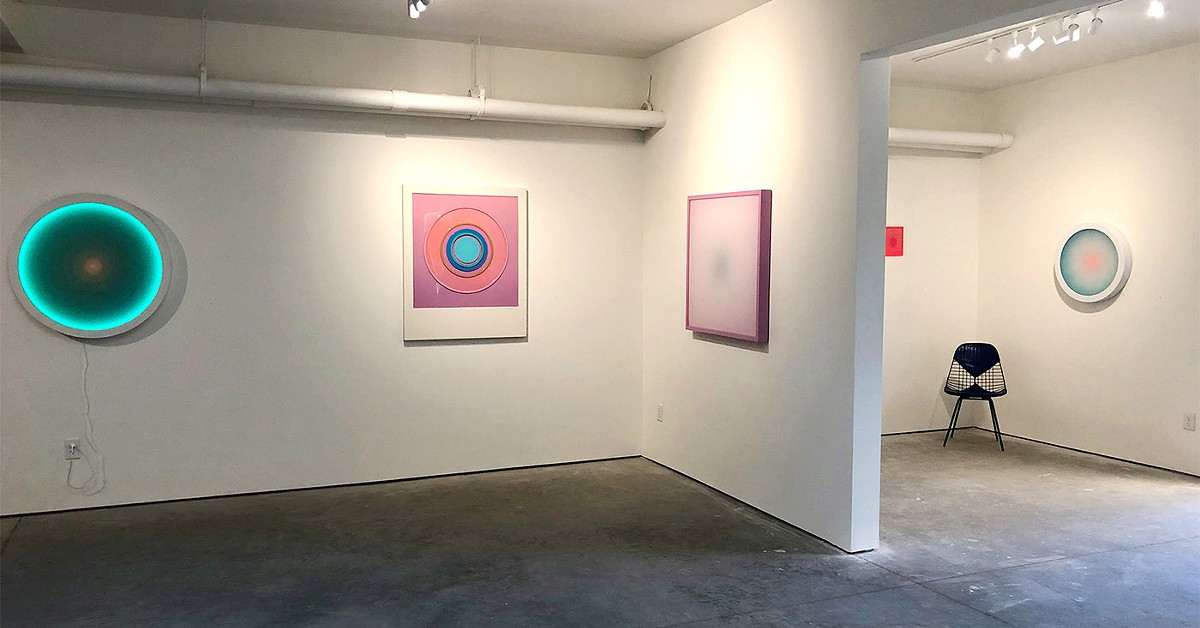
The new gallery of artist John Brooks, Quappi Projects, is a crisp, stark and compact area that is perfectly complemented by the color saturated Op art pieces of Louisville artist Letitia Quesenberry. The inaugural exhibit “(((heat)))” is an exercise in restraint. Quesenberry’s striking pieces are simply notated by a small letter that corresponds to the title and additional information, which is on a flier, thus eliminating the descriptive placards that often accompany artworks. This lack of written information allows for individual interpretation of the pieces so, in essence, what you see is what you get.
The term Op art arose in the 1960s and refers to a formalized, technical approach to creating rather than relying on instinct and intuition, as in Impressionism, or subjectivity and emotion, as in Abstract Expressionism. With a focus on an orderly overall design, Op art examines the correlations between color, line, perspective and figure — ground organization. For example, the use of color theory to create a visual vibration within a composition adds movement to the piece and is the result of how the eye functions. In addition, an actual moving component may be included in the piece to enhance the illusion.

Quesenberry takes these elements and raises them to a new level. The collection ranges from large composition to groupings of smaller, related pieces, all of which, save one, is nonrepresentational. The gallery is filled with mesmerizing, highly graphic, resolved pieces that draw the eye in. In the grouping “as of yet,” an assortment of shapes, textures, colors, materials and compositions are unified by standard-sized Polaroid-like framing that Quesenberry has handcrafted. From afar, the images have a perfect, factory-like quality. They are glossy, precise and exacting. Upon closer examination, slight flaws are noticeable. A small crack in a mirrored surface or an ever so slightly crooked line harkens to the human element within the work. The polished surface almost completely conceals the flaw, but the imperfection is what adds interest and accessibility.
Her larger pieces echo these smaller ones but are not limited to the uniform formatting. There are diamonds, circles, rectangles, large squares and triangles, some of which incorporate light, others move out of the picture frame in a subtle bas-relief and yet others have a softer, almost pastel color palette. The roughly eight feet by eight feet “big heat” has a vertical, elliptical shape centrally located on the picture plane with color gradation echoing the form. The color palette ranges from purple to fuchsia and is softened by the hand-dyed gauze that overlays the piece. A shallow shadow box frames it and conceals the LED lighting that slowly changes color and, in turn, changes the color and hues of the base image. The piece pulsates, seeming to breathe. The darker center of the ellipsis recedes and returns, suggesting a heartbeat or a portal. The soothing, meditative movement takes the viewer beyond the art piece and into a light-infused visual experience. Through perception the piece becomes interactive and, in turn, accessible.
The piece “anon 2” has a surprising tactile quality, contrasting with the cerebral experience offered by the LED pieces. Concentric circles are framed in the Polaroid format, with hand cut panel circles layered on top of each other, slightly elevating the surface. The image harkens to an atom, or a microcosm. Contrasting, bright colors enhance the levels and are held in place by thickly-poured resin. Here the light is reflected off the highly glossy surface, and the movement is in the shallow relief of the circle. The impulse is to reach out and touch the smooth, yet irregular surface. This piece has a density that contrasts nicely with the ethereal quality of the other works. This density can also be found in the series “how this came to be.” This series is a horizontal linear grouping of deeply color-saturated pieces, which feature a singular biomorphic image that may contrast or complement the background and frame color. The placement of the form, which could be an amoeba or a distant galaxy, is different in each painting and when lined up, the effect is kinetic. These pieces have a primal quality to them, as if we are looking deeply into time or space.
The smallest, and the only figurative image, in the exhibit, “little darlings #243” is from her ongoing series titled “little darlings” and could be seen as the closing piece of the exhibit. Depicted in the Polaroid format is a female figure wearing sunglasses, hands on hips, shown from the hips up. Concentric circles in tones of red surround the slightly off-center image, giving it a visual heat. In contrast to the broad, expansive and conceptual nature of the collection, this small figure serves to remind us that what we see is a reflection of who we are. •