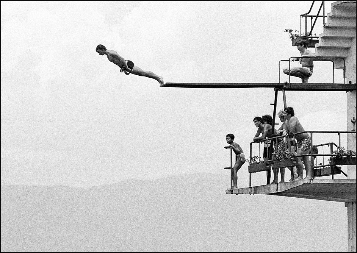
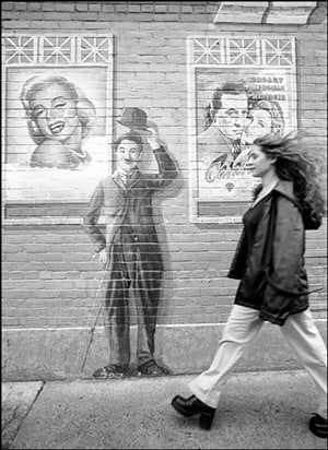
“I feel very fortunate to be a part of our artists’ community,” said photographer Keith Auerbach (auerbachphoto.com). “I love the creative process and am fascinated when other artists, writers, musicians, poets and playwrights talk about what they are thinking and feeling when being creative.” It’s only fitting we get to read his thoughts and feeling about creativity, too.
LEO: What type of artist are you, and when did you start making art? Keith Auerbach: I am fundamentally a self-taught humanistic photographer. My first encounter with the visual arts was in my first year of college. I read all of the courses offered at the university each semester, and I kept selecting art history courses. This was the first hook. I fell in love with visual images, especially painting, sculpture and photography.
The second hook was when I took a beginning photography course in the School of Journalism. The first time I put a white sheet of paper into the chemical developing bath and saw a photograph appear, I was enthralled by the sheer magic of the process. I still feel the same way today when I see the photographs coming out of my digital printer. In this course, I was also exposed to Henri Cartier-Bresson and his brand of insightful humanistic photojournalism, which not only inspired me, but put me on the ramp to my creative path.
I began to feel like an artist after my first solo exhibition ‘Familiar Fictions’ at Actors Theatre. Then, for nearly 15 years, my images appeared in LEO Weekly as a freestanding column. After LEO Weekly was sold, the new owners [SouthComm Inc.] decided not to use my photos. Fortunately, PYRO asked me to join their new co-op gallery about the same time.
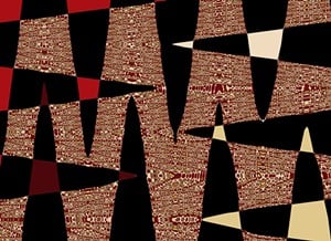
Artists find inspiration from unusual sources. Has being a psychiatrist influenced your art? Yes, in many ways, albeit the influence is subtle. There is an interesting parallel between graphic designers and psychotherapists. Each new client and project is different, so a graphic designer has to totally focus on what are the needs of each project. Similarly, a psychotherapist has to discover and focus on the needs of each individual client, or patient, at that moment in that session. We both have to respond to something new each time. This is reflected in my art as the range of interests of my exhibitions, which include humanistic observation, humor, color abstract expressionism, a serious exhibition on addictions, and, currently, a project of textile designs. My next PYRO exhibition [in 2017] will be only about light. Secondly, almost all of my work has a subtle psychological and emotional undertow. When I invented a technique to transform color photographs into abstract art — a process dubbed ‘woozalating’ — the color images and their titles are functionally just Rorschach/projective tests. You look at the image and read the title and think: ‘What is this about?’ And then you must see your own life in the work. My first color abstract show was titled ‘The Illusion of Certainty.’ The second color show was called ‘Everything Is Metaphor.’ The exhibitions titles and the titles of each individual image are spiritual and psychological. The exhibition ‘Inside The Experience of Addiction: Photo Stories On Using, Abusing and Recovery’ is intentionally designed the same way. For example, the photograph ‘I Was Living the Dream and Becoming the Nightmare’ is relatable to all of us, but your dream and your nightmare are specific to you. So, looking at the photograph together creates an opportunity for us to talk about our different feelings and perspectives. This is a psychological process.
Thirdly, when I am concentrating as a psychotherapist, whatever someone is feeling appears in my mind as a photographic visual metaphor which, when I convey it to my patients, often clarifies for them what they're feeling. As a therapist, I hear everything that is being said for what it literally is, but I also hear it a second time as a metaphor for a bigger, larger psychological pattern. Hence the title of my second show is ‘Everything Is Metaphor.
What has been the largest display of your work at one time? Since I have not yet had a retrospective, the largest display of my work has been during my solo PYRO exhibitions, which are every other year. So far there have been six beginning [in] 2005. I will have my seventh solo exhibition in 2017.
You have a new project in the works – designing scarves with horse themes. How did this come about? After I began making color abstracts, people kept commenting that I should consider seeking out textile designers, wallpaper designers or rug designers, because my images would be natural for those endeavors. Once I went into the showroom of a large textile manufacturer and asked if they ever used outside designers. I showed the manager some examples of my color abstracts. She commented that my designs were different and unique, because I was approaching the design from an art perspective that is very different from the textile designer's approach. She gave me the contacts of the main headquarters in New York City but I did not follow up this lead. One day Payal Parekh, whose family had been top artisan, handcrafted silkscreen manufacturers for many years, came into one of my exhibitions. She asked me if I would be interested in designing for them. This was the beginning of our collaboration. She had a clear vision. She wanted me to design horse textile scarves. She asked me to design these but gave me three very specific guidelines: The designs must be ‘evergreen,’ by which she means wearable in all four seasons, and classical so they are still wearable in 30 years. [They] must have an international appeal and sensibility, such that the French, the Italians, the Americans, the Swedes, etc., all would be interested in them. The representation of the horse should never have been seen before in the history of fashion.
I immediately recognized that my technique of woozalating would be the solution. I would embed the horses in an engaging design so they would be subtly present. The Silkhorse scarves have very deep roots. Payal grew up in Mumbai, India. Her grandparents [taught] her about the gods, one of whom rode a horse called Manaki. When thinking about Manaki, in your mind, whatever obstacles were in your path would be removed.
She married Geoff Bugbee, a Louisvillian and a photographer. She moved to Louisville. After a few years, she had the vision of making a series of East-meets-West scarves that would contain the spiritual power of Manaki, with the speed, power and beauty of the American and European horse. She had a Hindu artist draw me a Manaki horse which I scanned and deconstructed to use in my designs. The scarves are the highest quality — however, most top couture houses' scarves are machine made, and Parekh-Bugbee scarves are artisan handmade silkscreens and are a larger size. The debut of the scarves is going on now in the Kickstarter campaign (through Nov. 11). Anyone interested should go to parekhbugbee.com. I suggest watching the three videos which tell about the project, show manufacturing process and demonstrate 15 different ways to fold a scarf for different looks.

